.jpeg)
Before you even think about firing up a spreadsheet or a fancy BI tool, the real work of sales analysis begins. It's all about setting the stage. Without a clear plan, you're just number-crunching in the dark, hoping to stumble upon something useful. A strategic setup is what separates actionable insights from a pile of interesting but ultimately useless charts.
Setting the Stage for Meaningful Sales Analysis

The single most important thing you can do is ask the right questions from the get-go. What business problem are you actually trying to solve? Are you trying to figure out why your top product's sales dipped last quarter? Or maybe why one sales region is outperforming all the others?
Without a specific, guiding question, you're just exploring numbers without a destination. Purpose-driven analysis is what leads to real results.
Once you have your question, it tells you exactly where to look for the answers. Don't make the rookie mistake of only looking at your transaction logs. The full story is never in just one place. You need to pull from multiple systems to get a complete picture.
- CRM Logs: This is where you'll find the narrative behind the numbers—customer interactions, where deals stall, and how long your sales cycle really is.
- Transaction Records: The raw numbers live here. It's great for analyzing purchase history, order frequency, and average deal size.
- Customer Support Tickets: Often overlooked, this data is gold. It can reveal product issues or service gaps that are secretly killing your sales.
- Website Analytics: This connects your marketing spend to actual results, showing which channels are bringing in the leads that actually convert.
Weaving these sources together gives you the context that a single dataset just can't provide. It’s how you connect the dots between a marketing campaign, a sales outcome, and a happy, repeat customer.
Defining Your Core Metrics
With your goals set and your data sources identified, the next step is to pick the right metrics—the numbers that will actually measure your progress. It’s easy to get distracted by "vanity metrics" that look good on a slide but don't impact the bottom line.
A common pitfall is getting completely lost in the data without a clear purpose. The goal isn't just to report numbers; it's to uncover a story that guides your next business move. Start with a specific question and let that be your north star.
For example, the global eCommerce market is on a rocket ship, expected to blow past $8 trillion by 2027. On top of that, 52% of online shoppers are now buying from international stores. If you're not analyzing your cross-border sales data, you could be leaving huge growth opportunities on the table.
Focusing on the right metrics is a foundational part of any solid business development strategy. Before diving deep, make sure you have a handle on the fundamentals.
Here's a quick look at some core sales metrics that should be on every team's radar.
Core Sales Metrics to Track
Tracking these ensures your analysis stays grounded in what truly drives sustainable growth. They provide a direct line of sight into the health of your sales engine.
From Messy Spreadsheets to Reliable Data

Before you can pull out any game-changing insights, you have to face a hard truth: raw sales data is almost always a mess. It's the unglamorous but absolutely critical part of the process. Trying to analyze your sales numbers without cleaning them up first is like building a house on a shaky foundation—it’s just going to crumble.
Imagine you've just pulled sales reports from your Shopify store and a separate point-of-sale system. One file lists states as "CA" and "NY," while the other spells them out as "California" and "New York." Without fixing that, your analysis will treat these as four completely different regions, totally skewing your results. This is where the real work begins—creating a single source of truth.
Spotting and Fixing Common Errors
Your first sweep should focus on hunting down the most obvious culprits. Inconsistencies and duplicates can hide in plain sight, distorting your totals and averages. These aren't just minor annoyances; they're genuine threats to the accuracy of your conclusions.
Here are the usual suspects to look for:
- Duplicate Entries: A single customer order that shows up twice can artificially inflate your revenue and throw off your average deal size.
- Formatting Issues: Inconsistent date formats (like MM/DD/YY vs. DD-MM-YYYY), different currency symbols, or extra spaces can stop your software from sorting and grouping data correctly.
- Typos and Variations: Simple misspellings in product SKUs or city names can fragment your data, making it impossible to see the whole picture for a specific item or location.
Most spreadsheet programs have built-in tools to help with this. For instance, Excel’s "Remove Duplicates" feature is a powerful first line of defense.
Here’s a quick look at how to find this function in Microsoft Excel.
This simple tool lets you choose which columns to check for duplicates, giving you precise control to clean up your dataset in just a few clicks.
Handling Missing Data and Unifying Fields
Once you've dealt with duplicates, the next challenge is tackling all those empty cells. A sales record with a missing deal size or customer region is pretty much useless for certain kinds of analysis. You'll have to decide whether to fill in the missing info, use a placeholder like "N/A," or just remove the entire row.
The goal of data cleaning isn't to achieve absolute perfection—that's often impossible. The real goal is to create a dataset that is consistent, reliable, and "good enough" to support confident decision-making.
Unifying fields is just as important. I often use functions like TRIM to get rid of extra spaces and PROPER to standardize capitalization. For more complex fixes, like converting state abbreviations to full names, a simple VLOOKUP table can automate the work across thousands of rows. Taking these steps is non-negotiable for anyone serious about improving their eCommerce analytics.
This meticulous process transforms your chaotic spreadsheet into a trustworthy asset. Only with clean, reliable data can you move on to the next stages of analysis, confident that your findings actually reflect reality.
Picking the Right Analysis Method for Your Goal
Once your data is clean and reliable, it's time to decide how you'll look at it. The analysis method you choose hinges entirely on the questions you're trying to answer. It’s a bit like a detective picking a tool from their kit—you wouldn't use a magnifying glass to dust for fingerprints. The right method is what turns a pile of numbers into a compelling story.
Think about the modern B2B buyer's journey. It’s no longer enough to just track final sales figures. In today's B2B world, an average of 7.4 decision-makers are involved in a single purchase. On top of that, nearly 70% of the buyer's journey is complete before they even speak to a sales rep. These stats, highlighted by Spotio.com, show you need to analyze their digital footprints—what content did they engage with? What research did they do on their own?
This whole process follows a pretty logical flow: you gather the raw data, analyze it to find what matters, and then use those insights to predict what's coming next.
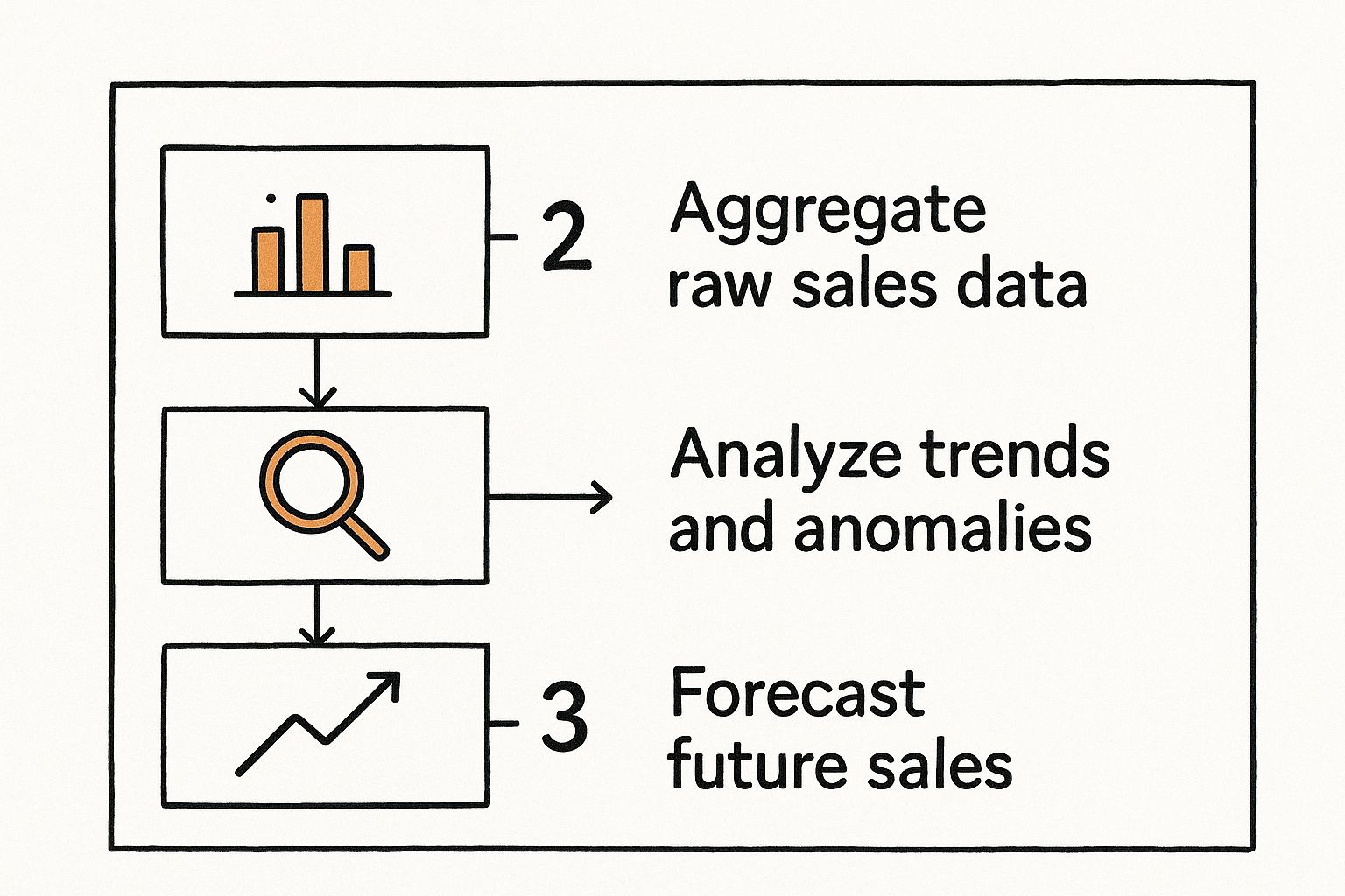
As the graphic shows, it’s a fundamental workflow: collect information, identify key patterns, and then use what you’ve learned to make smarter forecasts.
So, how do you actually do that? Let’s walk through the most common methods.
Uncovering "What Happened" with Trend Analysis
Trend analysis is your go-to for getting a bird's-eye view of performance over time. It directly answers the question: "What happened?" By plotting sales data across days, weeks, or months, you can immediately spot patterns, momentum, and seasonality.
For instance, are your sales consistently spiking in the last week of every quarter? That could mean your team is hustling to hit their numbers. Or maybe sales for a specific product category tank every summer? That’s a seasonal trend you can get ahead of with a targeted promotion in the spring. This method is brilliant for tracking long-term growth and setting realistic goals.
Digging Deeper with Diagnostic Analysis
Once trend analysis shows you what happened, diagnostic analysis helps you figure out why. This is where you put on your investigator hat and drill down into the specifics behind an anomaly you’ve spotted.
The most powerful insights often come from asking "why" five times. A sales dip isn't just a number; it's a symptom. Keep digging until you find the root cause, whether it's a competitor's new launch, a broken link in a marketing email, or a shift in customer behavior.
Let's say you see a sudden drop in sales for your best-selling product. With diagnostic analysis, you’d start asking pointed questions like:
- Did we change the price recently?
- Did a competitor launch a major promotional campaign?
- Are there new negative reviews or customer service issues popping up?
- Did our website traffic from a key marketing channel suddenly decrease?
This approach connects your sales data to other business activities, giving you a complete picture of the forces at play.
Forecasting "What Will Happen" with Predictive Analysis
Predictive analysis takes your historical data and uses it to forecast future outcomes. This is how you shift from being reactive to proactive, anticipating demand and making strategic moves based on data-driven probabilities. It's less about a crystal ball and more about smart statistical modeling.
By looking at past sales cycles, seasonality, and market movements, you can create solid forecasts for everything from inventory needs and staffing levels to revenue projections. These models get even more accurate when you automate sales processes to feed real-time data directly into your forecasting engine.
To make sense of these different approaches, it can be helpful to see them side-by-side. Each method answers a different core business question.
Comparison of Sales Analysis Methods
Ultimately, picking the right method comes down to matching your technique to your business objective. Start with trends to get the big picture, use diagnostics to investigate anything unusual, and lean on predictive models to get ready for what’s ahead.
Telling Your Data's Story with Visuals
Let's be honest, a spreadsheet packed with numbers is powerful, but it rarely gets anyone excited. Columns and rows of raw figures just aren't how the human brain likes to process information quickly. This is where data visualization comes in, turning your hard-won analytical findings into a story that anyone can grasp in a single glance.
It’s the crucial bridge between complex analysis and clear, decisive action.
The point isn't just to make flashy, colorful charts. The real goal is to communicate your insights with absolute clarity. A well-designed visual report can spotlight trends, expose outliers, and reveal relationships between metrics far more effectively than any table of numbers ever could. This is the essence of modern sales analysis.
Matching the Chart to the Question
The first rule of great data visualization? Pick the right tool for the job. Using the wrong chart can be even more misleading than no chart at all. Each visual has its own specific strength, and knowing when to use which one is a skill every analyst needs.
- Line Graphs: These are your go-to for tracking performance over time. Want to show monthly revenue growth, weekly lead generation, or even daily website traffic? A line graph makes trends and seasonal patterns pop right off the page.
- Bar Charts: Perfect for comparing different categories. A bar chart is the clearest way to stack up sales performance across regions, see how marketing channels compare, or identify your best-selling products.
- Heat Maps: Fantastic for showing density and concentration. For instance, a heat map can instantly show you the busiest days and times for customer purchases, helping you fine-tune everything from staffing to promotional timing.
To really nail your sales reporting, it’s worth taking the time to explore various data visualization techniques and see what might work for your specific needs.
Building Intuitive Dashboards
Often, the ultimate goal is to build a centralized dashboard—a single screen where your team can get a live, at-a-glance pulse on the business. This is exactly what tools like Google Data Studio, Tableau, or Microsoft Power BI are built for. They let you pull in data from all your different sources and display it as a collection of interactive charts and scorecards.
Here’s a great example from Google Data Studio’s gallery that shows how different visuals can come together to tell a complete story.

You can see how this dashboard effectively combines a map for geographic data, line charts for performance trends, and big-number scorecards for an immediate, high-level overview.
A truly great dashboard is clean, intuitive, and focused. Resist the temptation to cram every possible metric onto one screen. Instead, zero in on the Key Performance Indicators (KPIs) that tie directly back to your business goals. The best dashboards I've ever built or used are also interactive, allowing people to filter by date, region, or product to dig in and explore the data for themselves.
The best data visualizations spark curiosity. They don't just present an answer; they encourage the viewer to ask the next question. This is how you start building a truly data-driven culture.
By turning your raw sales numbers into a clear visual narrative, you empower everyone in your organization—from front-line reps to the C-suite—to make smarter, faster decisions. It’s the final, and most impactful, step in mastering sales data analysis.
You’ve done the hard work. You collected the data, scrubbed it clean, and built some eye-opening visualizations. But all that effort is just a prelude to this one critical moment: turning what you've found into real-world business actions.
An insight is just an interesting fact until it sparks a smart decision. This is where your work jumps off the spreadsheet and starts impacting the bottom line.
The real skill in sales data analysis is connecting the dots to build a powerful case for change. You have to get good at spotting the difference between a "huh, that's neat" finding and a genuinely actionable insight. For instance, knowing 70% of your Q3 sales came from one product is interesting. Realizing those sales were overwhelmingly driven by a specific feature that customers keep mentioning in reviews? That's actionable.
From Data Points to Strategic Plans
An actionable insight is one that practically screams its own solution. It needs to answer the "So what?" and "Now what?" for your team. This is how you shift from simply reporting on the past to actively shaping what happens next.
- Sharpening Your Marketing: Did your analysis reveal a surprisingly high conversion rate from a niche blog post? That's your green light. Double down on that topic, create more content around it, or run targeted ads to a similar audience.
- Fixing Your Sales Process: What if you discover your sales cycle is 20% longer for deals that skip the initial demo? The action is crystal clear: make discovery demos a mandatory step for all qualified leads. To further tighten that funnel, you can also explore specific techniques for how to increase your sales conversion rate in our in-depth guide.
- Optimizing Products and Inventory: Did you spot a certain product bundle that consistently sells better than the individual items? That insight should immediately trigger inventory adjustments and maybe even a new "recommended bundle" feature right on your product pages.
These examples show how a single, well-framed data point becomes a launchpad for strategy.
Building a Business Case That Gets Buy-In
Walking into a meeting with leadership requires more than just a pretty chart. You need to tell a story that connects your insight directly to a tangible business outcome, like boosting revenue, cutting costs, or keeping customers happy.
The most persuasive recommendations are grounded in data but framed in the language of business impact. Don't just show them the numbers; show them the opportunity the numbers represent.
This is more important than ever. Companies are leaning heavily on analytics, with the market for big data tools projected to hit a staggering $549.73 billion by 2028. And for good reason. Businesses that invest in advanced analytics see performance bumps of at least 11%, proving that solid data work leads to real results. You can read more about these big data statistics to see just how critical this has become.
To make your case impossible to ignore, structure your recommendation like this:
- State the Core Insight: "Our analysis shows customers who watch video testimonials convert at twice the rate of those who don't."
- Propose a Specific Action: "Based on that, I propose we launch a three-month campaign to gather and promote new customer video testimonials on our key landing pages."
- Define the Expected Outcome: "With our current traffic, this could lift overall conversions by 8%, which we estimate would bring in $50,000 in new revenue next quarter."
This simple framework transforms your analytical findings into a concrete, compelling business proposal that demands attention.
Of course, here is the rewritten section, following all the provided guidelines and matching the expert, human-written style of the examples.
Common Questions About Sales Data Analysis
Even with a solid game plan, you're bound to run into questions as you dig into your sales numbers. It happens to everyone. Getting clear answers is what helps you push past those roadblocks and make sure your analysis actually leads somewhere useful.
Let's walk through some of the most common questions I hear from teams who are just getting their sea legs with sales data.
What Are the Most Common Mistakes to Avoid?
The absolute biggest pitfall is working with messy, unvalidated data. It's a classic "garbage in, garbage out" situation that guarantees your conclusions will be flawed from the start.
Another one I see all the time is getting distracted by vanity metrics, like raw website visits, instead of focusing on what really matters—like conversion rates broken down by traffic source. It’s also surprisingly easy to use the wrong chart type for your data, which just creates confusion instead of clarity.
But the most subtle—and damaging—mistake is forgetting to look outside your own bubble. A competitor launching a massive sale or a big shift in the market can completely change the context of your data. If you don't account for it, you'll end up misinterpreting your own performance.
Finally, don't fall into the trap of analysis paralysis. Chasing perfect, 100% complete data is a surefire way to get nothing done. The goal isn't to create a flawless historical record; it's to find insights that are "good enough" to help you make a smart decision today.
How Often Should My Team Analyze Sales Data?
There's no magic number here. The right cadence depends entirely on your business rhythm and how long your sales cycle is. The key is simply to establish a consistent schedule and stick to it.
For a fast-moving eCommerce brand, a weekly review of sales, ad performance, and conversion rates is pretty much non-negotiable if you want to stay agile.
On the other hand, if you're a B2B company with a six-month sales cycle, a deeper dive on a monthly and quarterly basis makes more sense. You'll be looking at bigger-picture trends like pipeline velocity and lead quality. In fact, effectively managing of sales leads almost always requires this kind of longer-term view.
The main thing is to be proactive. You want to spot trends and fix issues before they blow up, not just react to old news.
Which Tools Are Best for a Beginner?
You really don't need a pricey, complex platform to get started. In fact, you can get some seriously powerful results with tools you probably already have access to.
- Spreadsheet Software: Don't underestimate Microsoft Excel and Google Sheets. They're fantastic for cleaning data, sorting, filtering, and creating basic charts and pivot tables. This is where you'll find your first big insights.
- Free Dashboard Tools: When you're ready to build more interactive, shareable reports, a free tool like Looker Studio (formerly Google Data Studio) is the perfect next step. It connects right to your spreadsheets.
- Business Intelligence (BI) Platforms: Once your needs get more advanced, dedicated platforms like Tableau or Microsoft Power BI offer heavy-duty capabilities for wrangling massive datasets and creating complex visualizations.
My advice? Start simple. Master the fundamentals in a spreadsheet, then scale up your toolkit as your skills and needs grow.
Ready to supercharge your outreach with precision and efficiency? PlusVibe uses AI to create hyper-personalized email campaigns that hit the inbox and get replies. Stop guessing and start converting. See how over 1500 marketers are scaling their outreach by visiting https://www.plusvibe.ai.